Minimalist, Glam, or Clean Girl? Decode Your Brand's Look
Decode your visual identity with minimalist beauty packaging, glam skincare visuals, and clean girl aesthetics. Build product edits that reflect your brand vibe.
07 Jul'25
By Niharika Paswan

Minimalist, Glam, or Clean Girl? Decode Your Brand's Look
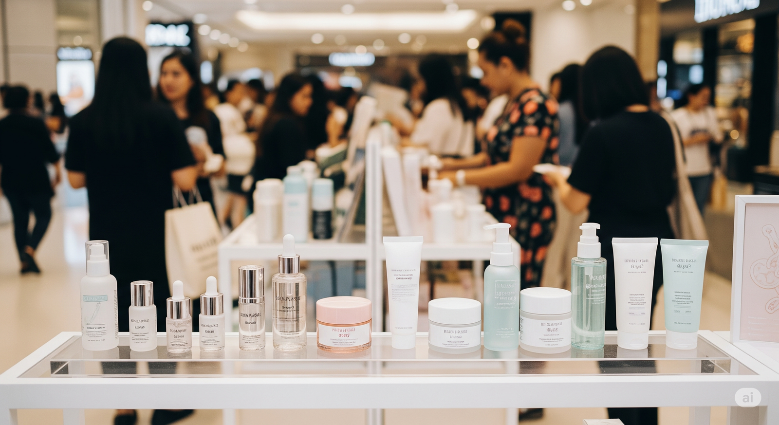
Every beauty brand tells a story, even before a product hits skin. It happens through a cap shape. A color palette. A typeface. A swipe motion. That first impression isn’t accidental. It’s visual language. And in beauty, that language is getting increasingly specific.
We’ve entered an era where users can tell whether a brand is minimalist, glam, or clean girl aesthetic at a glance. Not just because of the formula but because of how it’s styled, filmed, and edited.
These aren’t just trends. They’re aesthetic systems that inform everything from packaging to social content. And if you're building or refreshing a brand, understanding where you land and how to express it matters more than ever.
Let’s decode what each of these visual identities means, how they translate across product presentation, and why the difference between a matte cap and a mirrored pump is bigger than you think.
Why Brand Aesthetic Isn’t Just About Looks

Your aesthetic is your shorthand. It tells your customer what to expect, whether your product sits on a marble tray or spills out of a sparkly pouch.
It also helps you:
- Attract the right buyer
- Maintain consistency across platforms
- Build recognition through subtle cues
- Design packaging and edits that feel like a unified experience
Once you understand which visual lane you’re in, you can craft content, especially product-focused content that reinforces that lane over and over.
Let’s get into it.
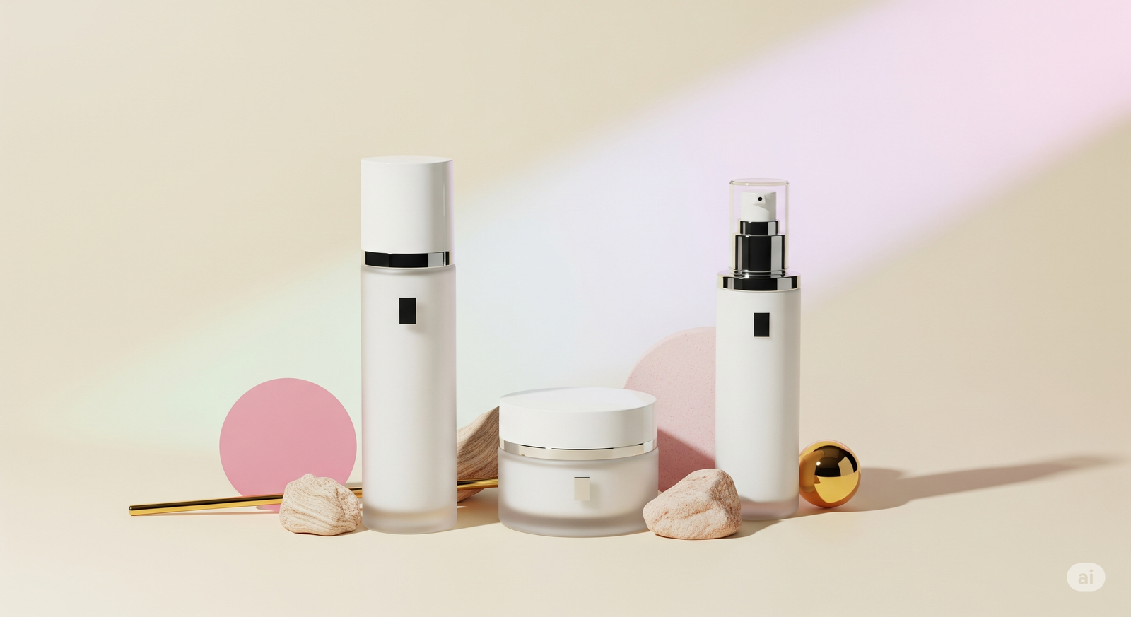
The Minimalist Beauty Packaging Identity
Core Traits Muted, architectural, monochrome or neutrals, sans serif fonts, high white space, soft matte textures.
The Message “I’m pure, intentional, and I know my ingredients.”
Packaging Tells
- Amber bottles with dropper tops
- Airless pumps in uniform beige or stone
- Glass jars with minimal labels
- No metallics, no decoration just clean function
Visual Language
- Static shots or slow pans
- Gentle natural lighting
- No loud music, just ambient or silence
- Minimal text overlays, if any
- Loops that feel like pauses, not performances
Edit Format
- Straight cuts, no transitions
- Real-time product dispensing
- Focus on formulation behavior (drip, melt, spread)
- Texture ASMR over glam effects
Minimalism is about trust through clarity. Your visuals should look like they’re breathing. Nothing too fast, nothing too styled. Just calm, tactile reality.
The Glam Skincare Visuals Identity

Core Traits Bold contrasts, sleek metallics, iridescent or high-gloss finishes, reflective surfaces, stylized typography.
The Message “I’m performance-led, luxurious, and unapologetically bold.”
Packaging Tells
- Jewel-toned bottles, gold foil embossing
- Pumps that glint in motion
- Mirrored compacts and precision-cut edges
- Layered or heavy lids that close with a crisp snap
Visual Language
- Light flares, sparkle accents
- Gliding shots with controlled zooms
- Overhead or dramatic lighting with clear reflections
- High-glam music cues or polished sound design
Edit Format
- Dynamic transitions (swipes, zooms, lens blurs)
- Emphasis on sheen, shimmer, and texture reveals
- Cutaways that echo makeup or high-end fashion campaigns
- Product “hero” moments with spotlighting
Glam visuals are unapologetic. Every second on screen should feel designed, not incidental. Your brand here doesn’t whisper, it sparkles and states.
The Clean Girl Aesthetic in Skincare

Core Traits Fresh, pink-nude neutrals, glazed or dewy finishes, simple but soft elegance, minimal effort but maximum glow.
The Message “I’m healthy, effortless, and skincare is my lifestyle.”
Packaging Tells
- Pastel caps, transparent bottles
- Rounded edges, squeeze tubes with precision tips
- Light-reflecting surfaces but not high-gloss
- Stickers or hand-drawn illustrations feel on-brand
Visual Language
- Morning light filters, bathroom sink tiles
- Dew on skin, water droplets, steam
- Warm fingers scooping balm, gloss smears on clear lips
- Everything looks kissed by daylight and air
Edit Format
- Soft transitions (fade, flow, light leak)
- Music with bounce, often acoustic or mid-tempo
- Close-ups of usage: swipe on cheek, dot on nose, lip tap
- Natural skin tones, ambient texture, lots of human touch
Clean girl visuals are about approachability meets aspiration. It shouldn’t feel too polished, just filtered through good taste and good light.
Admigos Adapts Animation to Brand Personalities
At Admigos, we treat brand style like a motion language. Whether you’re rooted in minimalism, glam, or the clean girl vibe, we build animation systems that reflect your voice.
For minimalist brands, we use quiet motion, clean fade transitions, and slow light gradients. For glam, we layer sparkle, shadow, and lens reflections that amplify packaging drama. For clean girl brands, we bring skin softness and real-time rituals to life with rhythm and human touch.
Animation isn’t one-size-fits-all. We adjust pacing, lighting, and even the bounce of a gloss squeeze to match your aesthetic profile. Because scroll-stopping visuals only work when they feel like you.
Still Not Sure Which You Are?
Many brands today blur lines. Maybe your packaging is minimalist but your content leans clean girl. Or maybe you’re a glam brand going through a soft rebrand.
Here’s how to refine your direction:
- Look at your packaging: Is it textured or sleek? Monotone or multi-finish? That’s your first clue.
- Audit your audience: Do they love ASMR, luxury looks, or GRWM style reels? Match their energy.
- Test motion styles: Post one soft, one glam, and one minimal edit. See what sticks and feels most right.
- Ask what emotion you want to lead with: Calm (minimalist)? Power (glam)? Ease (clean girl)? Let that guide your tone.
Remember: this isn’t about fitting in. It’s about creating coherence. When your product design, content, and motion all speak the same language, your brand becomes instantly recognizable, without needing to say a word.
Final Thought: Consistency = Confidence
You don’t have to pick a lane forever. But every scroll, tap, or swipe is an opportunity to teach your audience how to perceive you.
Choose visuals that align with your core emotion, your customer’s vibe, and your product truth. Let every cap, bottle, squeeze, and edit deepen that narrative.
Because in the crowded beauty feed, clarity wins. And clarity doesn’t mean complexity. It just means knowing who you are and animating like it.
The Clean Girl Aesthetic in 3 Seconds
Master the clean girl aesthetic with white tones, dewy light, and bare shelf edits. Create aesthetic beauty product visuals using clean girl packaging language.
Shelfies Are the New Showroom!
Create a scroll-stopping beauty shelfie visual. Explore how static setups, lighting-led edits, and texture layering elevate your aesthetic skincare lineup.